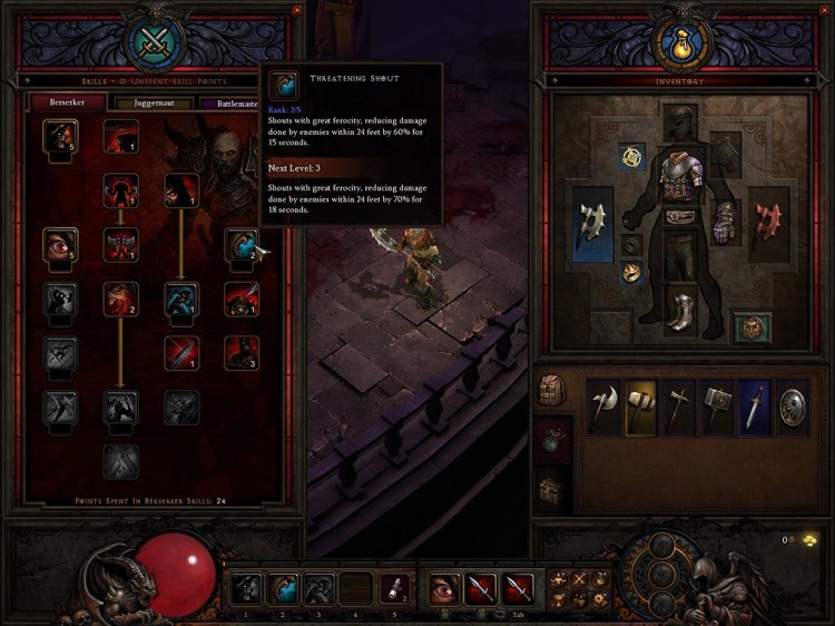
Here is a screenshot of the user interface used in the, to be released, Diablo 3. Kind of looks like the previous versions… which isn’t necessarily a bad thing. I’ll just don’t need to learn anything new, and when your old that’s a nice added feature.
I dig how they removed the MANA orb, I’m on the fence about the orbs, Does the health orb really need to take up that much screen real estate?


Leave a Reply